

Most executive dashboards fail in the same way. They are accurate, colourful and current, and they still do not change a single decision. Leadership sees forty indicators, most of them green, and moves on to the next agenda item. Months later a programme that was reported as on track for three consecutive quarters is found to be over budget and behind schedule. The problem was not a lack of data. It was a reporting architecture that converted data into display rather than into decisions. Within PMO and Execution Governance, PMO reporting and executive dashboards are the intelligence system through which leadership sees how strategy is translating into delivery, where capital is being consumed and where execution risk is accumulating. Their value is measured by one test: whether a deviation reaches the person with authority to act, early enough for action to matter. A dashboard that triggers no decision is decoration.
What Is PMO Reporting For?
Reporting inside a mature PMO is not a documentation exercise. It is the mechanism through which leadership monitors execution health across the portfolio of initiatives. The reporting framework consolidates delivery data, financial performance, risk indicators and milestone progress into structured intelligence, so that leadership sees the performance of the whole strategic programme landscape rather than a series of isolated project updates.
That visibility has a purpose. It allows intervention before execution drift undermines strategic objectives: reallocating capital, resolving a dependency between programmes, escalating a regulatory issue or stopping an initiative that has lost its rationale. Reporting that does not support those interventions is administrative overhead.
How Should PMO Reporting Be Layered?
A structured reporting system organises information across three levels of governance. Each level serves a distinct audience and decision, and each feeds the level above in a consistent form.
| Level | Audience | Focus | Typical Decisions |
|---|---|---|---|
| Portfolio | Board and executive committee | Status distribution, capital across programmes, strategic alignment, aggregate risk | Reprioritise, reallocate capital, stop or start initiatives |
| Programme | Programme sponsors and steering committees | Milestones, cross-project dependencies, capital deployment, benefit realisation | Resolve dependencies, approve changes, escalate risks |
| Project | Project managers and delivery leads | Schedule, cost, resources, issues | Assign actions, manage day-to-day variance |
The layering matters because operational signals must reach executive leadership in a structured form. Project detail stays at project level. What travels upward is the consequence of that detail for programme milestones, capital and strategic outcomes.
What Belongs on an Executive Dashboard?
Executive dashboards translate complex execution data into concise strategic visibility. Leadership needs immediate understanding of portfolio performance without reviewing extensive operational documentation. A well-designed dashboard therefore shows a limited set of critical indicators, each with a defined threshold and a defined response.
| Indicator | What It Shows | Illustrative Threshold | Expected Response |
|---|---|---|---|
| Portfolio status | Programmes on track, at risk or delayed | Any programme at risk for two consecutive cycles | Sponsor presents recovery plan |
| Strategic alignment | Spend and effort by strategic theme | Theme more than 10 points from target allocation | Executive committee rebalances |
| Capital deployment | Allocated, committed and spent capital, with forecast at completion | Forecast overrun above 5 percent | Change request to investment committee |
| Risk exposure | Unresolved critical risks and regulatory exposure | Critical risk open beyond 30 days | Escalation to risk owner’s executive |
| Milestone delivery | Key milestones achieved against baseline | Slippage above 30 days on a critical milestone | Dependency review at programme board |
The thresholds are illustrative. What is not illustrative is the principle: an indicator without a threshold is an observation, and a threshold without a response is a warning nobody owns.
Which Design Principles Make Dashboards Effective?
Clarity over complexity. Leadership needs concise signals rather than operational detail. The dashboard presents a small number of high-value indicators, and complexity remains in the supporting reports.
Standardised metrics. Indicators must be defined identically across every initiative. Without common definitions of status, variance and milestone completion, leadership cannot compare programmes or identify structural weaknesses.
Timely data. Information must be current enough to act on. Integration with project management platforms, financial systems and risk registers keeps indicators accurate and removes the manual consolidation that delays most reporting cycles.
Status with reasons. A red, amber or green status should always carry the reason, the forecast impact and the decision required. Colour alone invites optimism. Colour with a forecast invites scrutiny.
Trend over snapshot. A single reporting period shows position. Several periods show direction. Dashboards should display how each key indicator has moved over recent cycles, because a programme that has been drifting from green towards amber for three months needs attention before it crosses the threshold, not after.
Actionable signals. Every indicator should make clear where intervention is needed. If the dashboard cannot answer what leadership is being asked to decide, it is incomplete.
Why Do Dashboards Show Green Until It Is Too Late?
A recurring pattern in execution reporting is the programme that reports green on the outside while its underlying position is deteriorating. It usually has three causes. Status is self-assessed by the team whose performance is being reported, so optimism is structural. Status reflects progress to date rather than forecast at completion, so a programme can be on budget today and heading for a significant overrun. And thresholds are undefined, so the move from green to amber is a judgement call that nobody wants to make.
The remedies are equally structural. The PMO should validate status against objective rules. Financial indicators should show forecast at completion alongside actual spend. Thresholds should be written down and applied automatically, with status changes requiring evidence rather than permission.
Who Owns the Numbers?
Reporting credibility depends on clear ownership of each element of the process. Programme teams own the accuracy of their inputs. Finance owns the capital figures and the forecast at completion. The risk function owns the definition of critical risk. The PMO owns the standard definitions, the validation of status against the rules and the integrity of the consolidated view. Leadership owns the decisions that the reporting is designed to provoke.
When these roles are blurred, two problems follow. Programme teams that also validate their own status have every incentive to remain green. A PMO that also owns delivery outcomes loses the independence that makes its reporting credible. The PMO’s authority in reporting comes from neutrality: it reports what the agreed rules produce, not what any sponsor would prefer.
Ownership also extends to corrections. Where reported figures prove wrong, the correction should be visible, explained and traced to its source. A reporting system that silently restates history teaches leadership to discount it.
How Should Benefits Be Reported?
Most dashboards track inputs and activity well and outcomes poorly. Capital spent and milestones achieved are easy to measure. The benefits that justified the investment, such as revenue growth, cost reduction, regulatory capability or customer retention, often arrive after the programme closes and fall outside the reporting cycle altogether.
Executive reporting should therefore carry a benefits line for each major programme: the benefit committed in the business case, the measure used, the owner accountable after handover and the date by which it should be visible. Without it, the portfolio can be delivered on time and on budget while the strategy it was meant to advance stands still. Delivery is a means. Benefit is the measure.
A Worked Example: From Indicator to Decision
Consider an illustrative organisation running 24 strategic programmes with a combined approved budget of AED 1.2 billion. All figures are illustrative.
In the third quarter, a digital transformation programme with a budget of AED 90 million reports green: it has spent AED 41 million, broadly in line with plan. The PMO’s standardised metrics, however, show forecast at completion of AED 99 million, an overrun of 10 percent, driven by a vendor change request, and two critical milestones slipping by 45 days because of a dependency on a separate data migration programme.
Under the organisation’s rules, both thresholds are breached: forecast overrun above 5 percent and critical milestone slippage above 30 days. Status moves automatically to amber, with the reason and the forecast stated. The dashboard routes the item to the next executive committee with a defined question: approve AED 9 million of additional funding from contingency, or reduce scope by deferring two modules. The committee chooses deferral, and the dependency is escalated to the data migration sponsor. The decision is taken in one meeting, four months before the overrun would have appeared in actual spend.
Original Analysis: The Signal-to-Decision Staircase
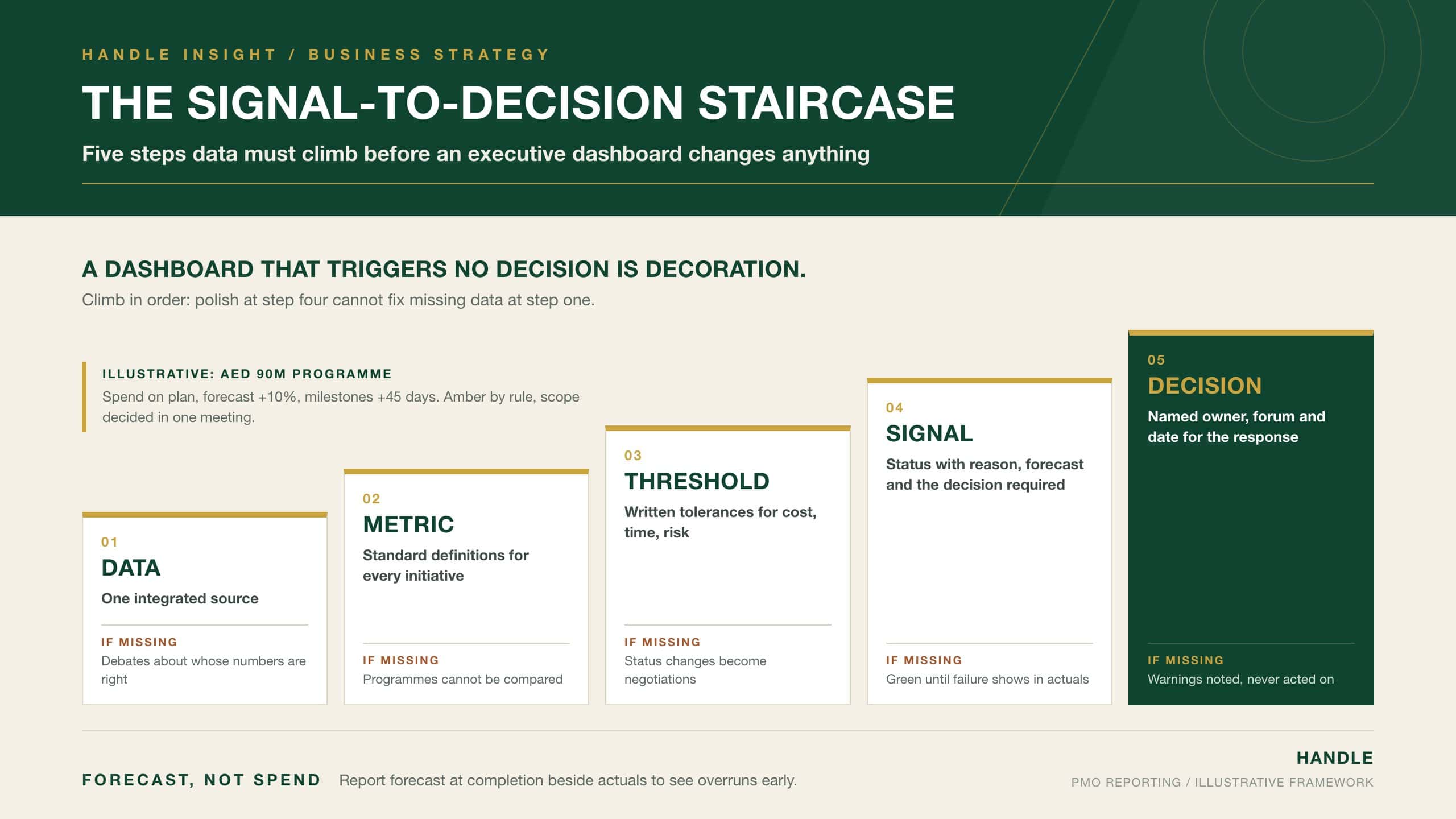
The Signal-to-Decision Staircase describes the five steps that data must climb before it is useful to leadership. Most reporting failures can be located on a specific step, which makes the model a diagnostic as well as a design tool.
| Step | Requirement | Failure if Missing |
|---|---|---|
| 1. Data | A single integrated source for delivery, cost and risk information | Conflicting numbers and debates about whose data is right |
| 2. Metric | Standard definitions applied to every initiative | Programmes cannot be compared |
| 3. Threshold | Written tolerances for cost, schedule and risk | Status changes become negotiations |
| 4. Signal | Status with reason, forecast impact and decision required | Green reporting until failure is visible in actuals |
| 5. Decision | Named owner, forum and date for the response | Warnings acknowledged and not acted upon |
The staircase is climbed in order. Investing in visual design at step 4 without fixing data integration at step 1 produces attractive dashboards that leadership does not trust. Defining thresholds at step 3 without assigning decision owners at step 5 produces accurate warnings that nobody acts on. The top step is the one that justifies the rest.
Reporting Cadence, Data and the UAE Context
Reporting systems operate within defined governance cycles. Execution intelligence feeds regular programme and portfolio reviews, where the PMO presents trends, performance changes and emerging risks, and leadership decisions then reshape priorities. This cadence turns reporting into an active governance instrument rather than passive monitoring.
Reliable reporting depends on integrated data architecture. Where departments maintain independent systems, figures diverge and credibility suffers. Consolidating delivery tools, financial systems and risk registers into one reporting environment strengthens the PMO’s authority.
For UAE organisations, two further points apply. Boards of listed companies operate under the governance requirements of the Securities and Commodities Authority, and portfolio reporting should support the board’s oversight responsibilities rather than duplicate management detail. Where dashboards include information about identifiable individuals, such as resource utilisation or performance data, the Personal Data Protection Law (Federal Decree-Law No. 45 of 2021) or the applicable DIFC or ADGM data protection regime should inform access controls and retention.
Common Failures in PMO Reporting
- Overloading leadership with task-level detail, which hides the few signals that require a decision.
- Running reporting cycles on stale data, so decisions are taken on conditions that no longer exist.
- Allowing each department to define status and variance differently, which makes comparison impossible.
- Reporting spend to date without forecast at completion, so overruns surface only when they are irreversible.
- Leaving thresholds undefined, so status changes depend on the willingness of a programme team to report bad news.
- Publishing dashboards without named decision owners, so warnings are noted and not acted upon.
Each failure breaks the path from data to decision. Each is repaired by fixing the step on which it occurs.
Conclusion
PMO reporting and executive dashboards form the intelligence system through which organisations govern execution. Layered reporting carries project detail upward as programme and portfolio consequences, and dashboards present a small set of standardised indicators covering status, strategic alignment, capital deployment, risk and milestones. Their effectiveness depends less on presentation than on structure: integrated data, common definitions, written thresholds, status with reasons and forecasts, and named owners who must decide. The Signal-to-Decision Staircase shows where a reporting system breaks and which step to repair first. In the UAE, board oversight expectations and data protection obligations should shape what is reported and who can see it. When the staircase is complete, deviations reach the right person early enough to matter. Visibility becomes control. Execution stays disciplined. Strategy stays protected.


